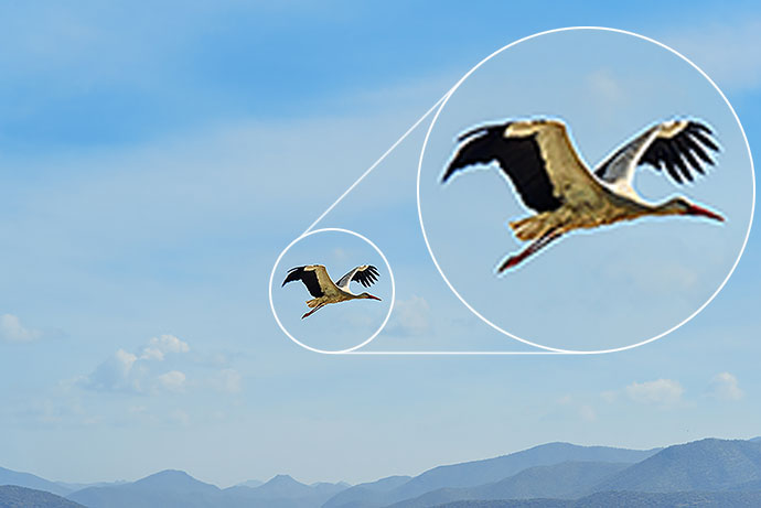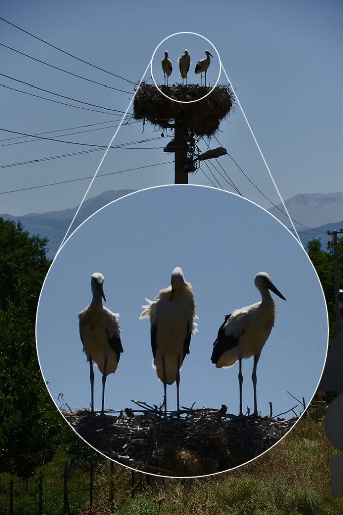
It started innocently. We were working on the next issue of a magazine for one of our customers. The texts and images were coming to our office one by one, everything was going well. Eventually, the time came for an article on the lightsome subject of storks living in Poland. The editor took the rich text under his wing (!), discussed the details with the customer, edited the article following the instructions, downloaded the photos which were to illustrate the text and – happy to be so quick and effective – sent it all to the graphic designer. If the editor could know what would happen next…
Seeing the subject he was going to face, the designer smiled to himself. He made himself comfortable in the chair and got down to work, whistling joyfully. But his joy did not last for long and his smile disappeared as quickly as it started when it turned out the photos are absolutely not suitable for print. The graphic designer did what graphic designers always do in such circumstances, that is he grabbed the phone, called the editor and said in a gravely voice that the customer must provide better photos of storks, as these are too small to be printed in a magazine. The editor, who was already working on a completely different project for a completely different customer, did an about-face and then did something that makes graphic designers tremble: asked if he is sure about this… Not going into details, the designer WAS SURE.
The next step taken by the editor was nothing unusual – a call to the customer:
“Our graphic designer has checked the storks photos and, alas! It turns out they’re too small and not good enough for print. I need to ask you to send bigger ones.
“Hm… I thought they were big enough, each of them weighed 2 or 3 MB, they looked good on the monitor.
“I thought so too, but no, we checked and they won’t do. Please try, we’ll wait.
“OK, I’ll ask the colleague who took the pictures to send me better ones.
An hour later the editor got new storks to the FTP. Her editor’s intuition was screaming into her ear not to praise the day before sunset, but for now, she decided to ignore those screams.
After a while it turned out the intuition was right. The graphic designer informed her that the new pics are just as good as the old ones, so we still have no photos.

Comfortless, the editor called the customer for the second time to tell him bad news. The astonishment was even bigger than the first time. With the eyes of imagination the editor saw the customer throwing up his hands, not seeing any chance to get better photos of storks. Being a reliable man, he promised to lean on the author of the photos and get back to the editor with information. Nervously making coffee and continuously discussing with the graphic designer the problem she was fed up with, the editor was trying not to listen to the voices of her intuition, which already knew this wouldn’t work.
Of course, the beastly intuition was right, the customer called back and informed her with regret, that there are no better photos. It is probable that they did exist, but the author must have decreased their size to make them lighter and got rid of the original photos which he can’t retrieve so… The only thing he found is this picture, it is quite large, oh, and it’s a TIFF, so maybe it’s better, only it seems a bit dark…

The editor downloaded the pic from the email to the right folder, and together with her inseparable companion Intuition she called the designer, whose comment did not leave any doubts. The photo was too dark. It could be brightened up in Photoshop, but the final result would not look good. Besides, what do we do with one photo when the article is four pages long…
Before the editor called the customer for the third time, she made a different call – to our photographer. She intrusively demanded that he told her where he was at the moment, adding that hopefully he’s not on a vacation. Luckily, the photographer did not got for a vacation, and by some miraculous coincidence it turned out he was going to shoot a session in Augustów the next day. The editor felt a new wave of power going through her body, she agreed with the photographer that if the customer accepts the costs he would set off earlier, take pictures of all the storks he sees on the way and send them to the agency.
And that was the moment for the editor to call the customer for the third time. She told him about the possibility for our man to take the pictures. The customer accepted the idea and the costs with a relief. He was probably also happy that the editor would not call him for the fourth time to lecture him on the inadequacy of the photos.
All’s well that ends well. The photographer was great as usual, and the pictures were fantastic – it was hard to decide which to choose. The whole article was now even more meaningful, because between the first session and the next one some time has passed and new little storks hatched out! It also turned out graphic designers actually like storks, but only if their pictures are of good quality…


Kategorie: school of contentic, B2C