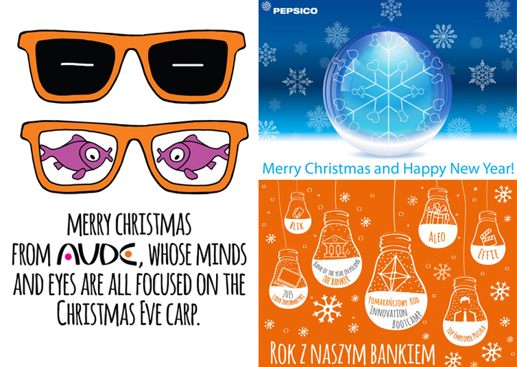

Over the past few days the computers in our office were full of Santas with hipster beards, reindeers flipping merrily around, stars from heaven, snowflakes, Christmas-trees and gift boxes because every client wants to have a Christmas accent – in magazines, on Christmas cards and in newsletters. “I want a happy Santa holding his hands up in the air holding the company logo!” “Make me Santa’s sleigh in the brand’s colors, packed with gift boxes with ribbons and cards with the client’s brands names attached…” – you can hear our shouts in the corridor. We do all we can to make Christmas designs unique each year, despite repeatable, well-known Christmas and New Year symbols. We have to keep pace with our clients. For instance, this year PepsiCo persuades us that Christmas is going to have… the blue color, and is running a strong Pepsi campaign away from the typical red and green color pattern, consistently using the blue color – on TV you can watch a commercial in which blue elves riding blue sleigh tell you that Christmas tastes best with Pepsi. They are said to have taken part in consumer research:) We used those very same elves in internal communication with employees, both in the newsletter and in the magazine we are now working at. Each year in December we prepare Christmas covers and each year our Christmas designs are different.
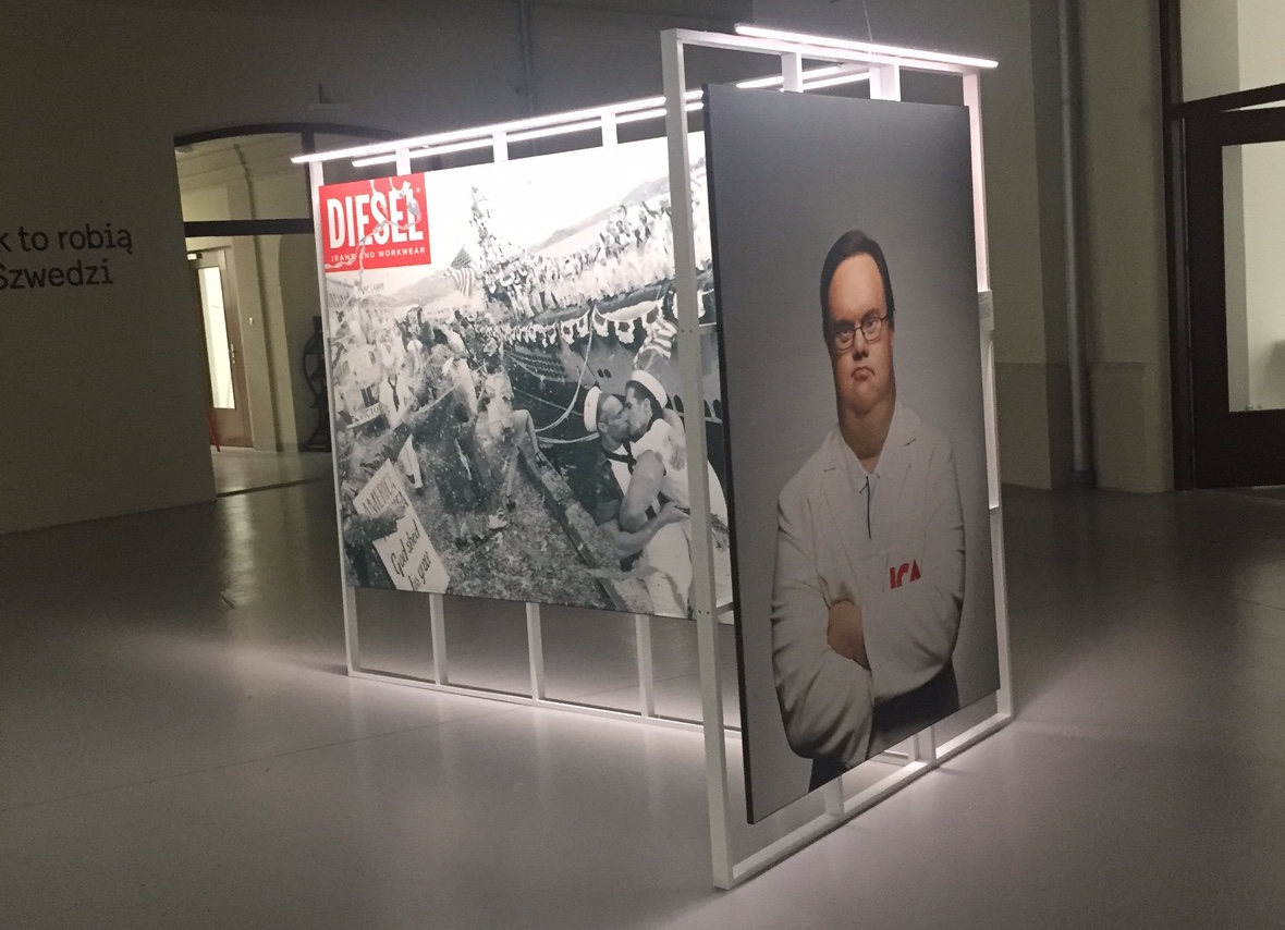
 We wouldn’t be able to do so if we weren’t looking for inspirations, if we didn’t follow what other experts from our sector are doing. Not so long ago three people from our agency completely independently went to see an exhibition opened recently in the Creativity Center (good name!) in the Praga district in Warsaw. There are twenty something people working at Aude, so three of us is quite a high percent 🙂 What attracted us was an exhibition organized by the Embassy of Sweden and the Swedish Institute called “More than Marketing – Communicating the Swedish Way” presenting three decades of advertising in Sweden. The exhibition is not big but memorable. Swedish advertising agencies are lucky to have a large group of public institutions and NGOs as their clients, so they are able to work at important social projects concerning e.g. immigrants, kids’ health or the disabled. The effects are breathtaking.
 For instance, the authors of a campaign for ICA food stores employed an actor with the Down syndrome to play a trainee at one of the stores. He was shown as a resolute employee who is being patronized by one of the regular employees – when talking to the trainee he speaks slowly and with exaggerated precision, repeating everything twice. When at the end of the day the supervisor asks the trainee if everything was OK, he confirms but asks if the man who kept repeating everything twice wasn’t a little dumb. Bull’s eye!
This one spot has done more for the disabled people than many experts on social campaigns. The series of commercials with the actor with the Down syndrome has been a hit, and the number of views on Youtube alone has reached a million.
Another strong campaign is the one with a photograph of a girl on the subway – whenever the train approaches the station her hair starts to blow in the wind. The effect is due to a photocell mechanism synchronized with the train entering the station, which gave the impression a blow of air is getting into the photo. That was definitely a “WOW!” effect. But after a moment the words of amazement wither, because the hair falls off, leaving the girl with a post-chemo bald head…
I went to see that exhibition in the week I should probably not get away from the computer due to the amount of work I had to do. I tried to convince myself I should go because it can be good for my set of skills…
A similar opinion belongs to Kasia Petruk, who thinks that going to the exhibition was a time well used:
“More than Marketing – Communicating the Swedish Way” is an exhibition full of intriguing and attractive projects. You can also notice how the creators play with the very convention of advertising. I particularly liked social campaigns developed for non-governmental organizations and institutions – they were made with even more confidence and boldness than the typically commercial ones. Often a simple idea is enough to draw your attention (like the comparison of two seemingly similar, but in fact drastically different pictures from the campaign showing how the birthplace determines our life.)”
Eventually, I felt relieved two days ago when I found a text by Natalia Hatalska, specializing in alternative forms of marketing communication, who admitted that during an important business conference she sneaked away to see the Body exhibition, because she believes that “you draw most inspiration from the fields away from your own; they are seemingly away from each other, but if you look closely, you can find many references to what you do every day. I try to stick to this rule whenever I can.”
Exactly, if you want to produce unique projects, you need to obtain your knowledge in a unique way – sometimes it can mean ditching work to go to an exhibition.
Kategorie: power of contentic, B2C