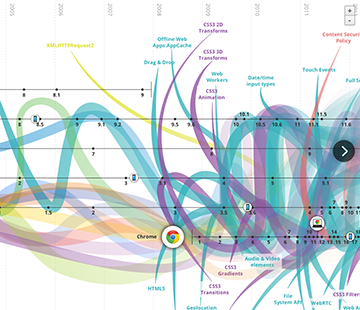
Indeed, there are many excellent examples, especially from abroad.
Interactive infographics are perfect for presenting data from many layers, as well as a large amount of data and information in a clear, organized and logical way. First, linear – they lead you smoothly through the time line, tell about the history, evolution and changes. Interactive presentation of an infographic focuses on intuitive interface that helps the reader reach the most valuable information. Graphics vary from narration to exploration experience and include real time infographics, panels and visualizations.
But good results require effort, and in this case – much effort, knowledge, experience and time. You need great webdeveloping skills for such projects – they are hand-made in html, javascript and css. Infographics like the one below are a complicated task, where no tool or program can make the job for us, you need to make it “by hand” from the scratch (even on an average computer).
“We can get something similar in EDGE, or EDGE+MUSE (the easiest animation), but this solution has its limits – you won’t be able to create any interaction you want: calculators or other use of the data obtained from users – that has to be prepared individually,” explains programmer Adam Grzegorczyk. “Interactive images are very search engine sensitive, some can work well only on one or several of them. For sure the older versions of Internet Explorer will be problematic.”
We hope you’ll be able to view them without any problems:


Vew our medical infographics and interactive presentation of information about cash credit.
Kategorie: school of contentic