
This requirement and the type of the reader are the basic criteria one must take into consideration when designing a layout. This is clearly visible in our layouts developed for various customers who come from different sectors and all have different needs. Publications for customers from e.g. the financial sector are calm and economical in form. They are clear, light, allow to focus on the content which is usually very precise. Magazines for lifestyle brands are more dynamic, colorful, they include funny graphic elements, usually have more images and the texts are shorter. Marcin Rutkowski, when discussing the examples of various layouts adjusted to the needs of customers, points to the fact that one can change the character of the basic layout by choosing different visual materials.
Take a look at what he means:
Lifestyle magazine – „@mazing” / Netia
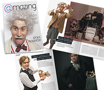
The magazine prepared for Netia is an example of a high-budget design, where the main role is played by photographs. The layout was to emphasize the images maximally, so in fact it is not only the layout that creates the final character but the expected result comes from the combining it with the photos. The pictures for this issue were taken during a long photo session with costume designers and make-up artists.
Science magazine / Nestle
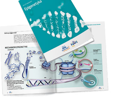
At the other extreme we have the magazine for Nestle, a serious scientific periodical, where the main role is played not by illustrations but by the substantial content. As illustrations we use here infographics, which combine the illustrative and informative functions. We focus on creating technologically advanced 3D infographics, which makes the magazine visually attractive while keeping its scientific character.
Bank magazine – “Baśka” / ING Bank Śląski
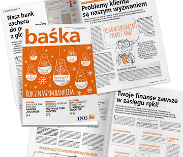
An interesting example comes from a magazine developed for ING Bank Śląski. The layout is calm, ascetic, as most publications for the financial sector are, but it contains illustrations with a carefully chosen typological character that add the “human” touch, emotions and softness. The drawings make the layout unique.
Freestyle magazine – „Power of One” / PepsiCo
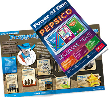
Here’s a magazine for PepsiCo, a company whose youthful character allow to use a more funky form. The illustrations are dominant, often referring to graffiti or comic books, the pages abound in colors, the background colors are strong. The graphic concept is just as important as the content itself.
Advice magazine – „Atlas fachowca” / Atlas
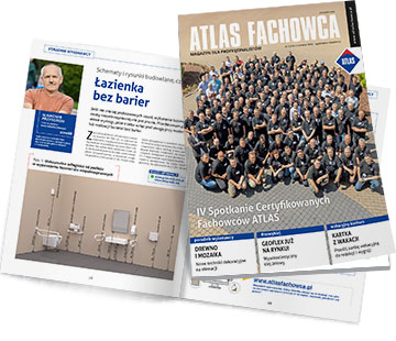
One of our youngest “children”, magazine for Atlas binders producer is a classic example of an advice magazine, where functionality is key. It is arranged in blocks of many elements, suggesting the reception and helping to navigate.
While writing this text I used interviews from the websites Na Temat and media2.pl
Kategorie: school of contentic, B2E, B2C, B2B