
 @MAZING…
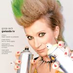
The cover of Netia magazine is collecting prizes at all the largest competitions, primarily due to the care with which we create the cover photo.
The preparations and the work often exceed those in commercial magazines. Starting with a coherent and bearing concept – which always encompasses the whole annual cycle – through make-up and styling (particularly careful in the case of costume cycles) up to the very careful and long photo shooting. A crucial advantage is an extraordinary layout, but one that does not disturbs illustrations. In Netia’s case the solution is minimalistic, but quite puckish. The masthead is at the bottom, which offers a surprising and unusual effect, but above all – it allows to better expose the photograph. The eyes of the characters on the cover are placed at the height of 2/3 of the page, and the painstaking hairstyles are not disturbed by the masthead.
@mazing wins due to its cover idea, professional and artistic performance – full of wit and sensibility, and the iron, extraordinary and unusual layout composition.
…AND THE REST OF THE WORLD
Cover finalists of the Pearl Awards 2014 (including the best B2C cover) are all similar – they fit in the illustration, non-photograph cover trend. @mazing stands out, “selling” the magazine with a real face.
 American Gas
Bold illustration. A bit kooky, illustrating the serious subject of investments in gas deposits.
 Mofo TEch
Pop-art Warhol-like drawing. Its great composition and gloomy atmosphere leaves no one indifferent.
 Move
Move
American-style hyperrealistic illustration, a road movie-like picture of an intelligent car.
 Stand
Stand
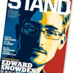
Considering it is a B2C category winner, I like it least, however, the many times repeated computer portrait of Snowden does have much graphic power, despite the officious computer-like character of the picture.
 Wolmart World
A very artistic and at the same time simple illustration. A fragment of the US flag brings to mind the cult images of Japser Jones and is a perfect illustration for the cover story: bet on u.s.
5 principles of thinking about the cover (according to Kevin Lund)
Don’t follow the rules – and surely not those regarding the design of kiosk magazines (title and headlines at the top), because you’re not making any. If your magazine is delivered by post or displayed in a cafe, you have the canvas of the entire cover to use
Show some good piece of art – we remember images, photographs, not the headline. If you are to make any kind of investment in graphic design, invest in the cover.
Use quality to show your brand, not the logo – the cover is not a trademark packaged in brandbook colours. Push the company to the background – instead of shouting from the „roof” you can place the logo in the bottom part of the cover, beyond the main view.
Don’t sell anything… yet – be a credible source of information, not a strident seller. Let them know you from your good side – the cover is what makes the first impression.
Catch attention for a little longer – you can use an original graphic instead of a stock image, unusual typography, a different type for a single letter, a catchy headline – anything that makes the customer stop and have another glance.
Kategorie: power of contentic