The way of engaging a mobile reader is a separate question to that about engaging readers in general, Neil Patel believes, co-founder of an eye-tracking application used by world’s largest brands. He wrote on contentmarketinginstitute: It’s time to let go well-worn paradigms about online content and how it’s received, a mobile reader is not like the desktop one and you need to know how to address them. Responsive design, even if it’s good, is not enough – “Smashing Magazine” is frank about it: “If responsive design is your only mobile strategy, you may lose your readers. When thinking about the mobile version you need to focus on the most critical point – copywriting and content editing.
This sounds particularly threatening when you take into account how mobile-friendly Google search algorithms have become. But mobile-friendly does not stand for mobile-only. We do agree that when preparing content we need to take into account how it’s going to be read on various devices, but creating a separate category of a “mobile reader” for text edition seems a bit of an exaggeration… We’ve decided to soothe the nerves of Polish publishers and confront Patel’s strong views with what experts on this side of the globe have to say about it.
“Personally, I’ve never seen websites to be that advanced and I doubt if they analyze UX that much developing their mobile websites etc. I’m sure the content is not that varied…” replied the first expert asked, Łukasz Kawęcki of Optizen Labs.
Many aspects speak up for this…
Marek Miller, Editor-In-Chief of Prasa.info, co-worker of the INMA (International Newsmedia Marketing Association) and co-author of the weekly TV program discussing the media and new technologies TOYAnet, in private a great fan and observer of the media market (he pays for the press and reads it mostly on his tablet), chills Patel’s radical aspirations:
“It’s true each distribution platform (print, online or mobile) is governed by its own rules, but I don’t agree with the argument about forgetting everything we know about preparing online content,” says Miller. “Writing a separate set of materials dedicated for mobile devices would be uneconomic. Remember a similar experiment, but for tablets, was made a few years ago by Rupert Murdoch with the “Daily” – content dedicated solely for iPad users didn’t attract enough paying readers to sustain it.
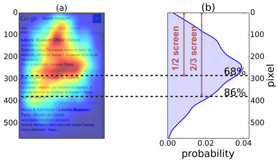
Patel points out to the fact that mobile content is scanned differently. “The F-layout, the Golden Triangle – what you have learnt about following content online is no longer valid in the mobile era, where there’s no space on the screen for such behaviors. Eye-tracking research shows that with smartphones we’re simply looking at the center of the screen. 68% of our attention focuses on the central and upper part of the screen, and 86% on the upper two thirds (image below – source). Anything below that point is less important,” Patel says.
 He believes this results in certain limitations for content, which should be as short as possible. “A short text is crucial even more because of the screen size, not so much the user’s attention focus,” Patel claims. “Your goal is to present the reader with the greatest possible amount of information on the screen from the very first moment – so that he doesn’t need to scroll or enlarge the page.
As a reply, Miller quotes different data: “According to Chartbeat, 90% of users scroll an article and does not base their impressions only on the look of the first screen. The author is right that user’s eyes follow a smartphone screen differently than that of a computer, but the habit of scrolling the article is found on mobile and desktop platforms alike,” Miller adds.
The essence
The “make it short” principle is quite broadly discussed by Patel.
First, short paragraphs.
“Short paragraphs are comfortable to look at and go in line with how our eyes work,” Patel says. “You need to let the reader get into a predictable and coherent rhythm of a visual travel through the article. A series of short fragments works a bit like the rhythm in a song – the reader is constantly on the move, jumping from one paragraph to another consistently and to the very end.”
Sounds too abstract for a convincing argument? Patel reaches for the reality of sociological observations, quoting US News: “Reading long paragraphs on a mobile device requires concentration – something people using mobile devices usually don’t have.”
 Second, short strong header
The author advises: Avoid monstrous, elaborate titles. Collaborate with the graphic designer to design a smaller font and with a skilled editor, who’ll make it more essential. All that to make the text easy to scan with your eyes.
… followed by a strong first paragraph
A telephone screen has room for one or two paragraphs without scrolling down. For this reason you should start your article with a few attention grabbing lines, Patel claims. The first sentences increase readers’ expectations regarding the text and grab their attention. You need to encourage them to view the lower part of the screen, Patel continues with regard to the research results. Substantial and catchy words are also important for another reason: the reader should get some “take away” sentences – conclusions and thoughts that are worth remembering.
All this sounds right and… somewhat familiar. We’ll find similar tips in nearly all article writing manuals.
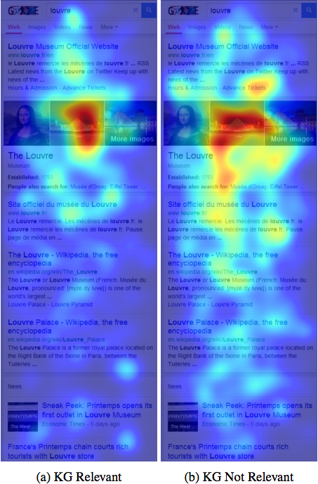
The content itself, as has been pointed out by Patel, should not have any needless words, expressions, sentences or points. Besides, why bother about writing long when people prefer to look at images… And here we get to Patel’s next note: a smartphone user’s sight is more attracted by a photo/image regardless of the place it takes, its content and meaning (image below – source). Based on that, he advises to reduce the use of images to a necessary minimum, not to load the text with graphic images which would draw the reader away from the text (unless that’s an infographic, of course :P).
 “Patel points to many important issues when it comes to content publishing on mobile platforms,” Miller admits. “He seems to forget, however, about one important element, mainly the users’ preferences and expectations. It’s true, we can adjust titles and leads to introduce the reader to the subject faster and more dynamically, but when it comes to content itself – readers of “Rzeczpospolita” or “Gazeta Wyborcza” dailies will have different expectations than the readers of “Kwejk” or Deser.pl. In the case of the latter the idea of limiting the number of images or photos seems off the mark (the point is, they must be easy to view, e.g. in the form of a gallery with the “swipe” function – Ed.). The former, on the other hand, will not expect to see fewer characters in the text.
The basic content differentiation (and its ratio to images) should actually start much earlier – at the stage of deciding what type of a reader we’re addressing, what are his needs and lifestyle, which tends to be very dynamic. Now that the cross-channel attitude is so widely used, it’s impossible to predict how and when readers reach our content. They may start reading on a smartphone and go back to it on the computer – or the other way round. Their expectations regarding content remain the same, and copywriting skills Patel has emphasized – e.g. focusing on the essence, grabbing attention from the first paragraphs, short headers and paragraphs allowing to scan the text quickly – should be important any time we get at writing an article.
A temporary agreement between the two experts can be found in the conclusion of Patel’s article. He advises not to stick to short texts only when writing for smartphones (even though it’s true some copywriters should simply write less). Long forms are still justified and alive – even in the era of mobile content consumption. His advice is: instead of cutting the text, start writing it right. Write as much as you need and as much as must be written (having removed everything redundant). Only this advice is simply universal…
“Despite numerous suggestions of this type in other sources, it is good Patel did not equal small screens with short texts,” Marek Miller admits. “I confirm that long articles are still popular, also on mobile, which is best proved by applications and mobile services such as Vox, Medium or Quartz. The most important part of the article, however, is the conclusion: don’t make your articles shorter, make them better instead – and I can’t image smartphones should require a separate – better – way of content creation”.
Kategorie: school of contentic