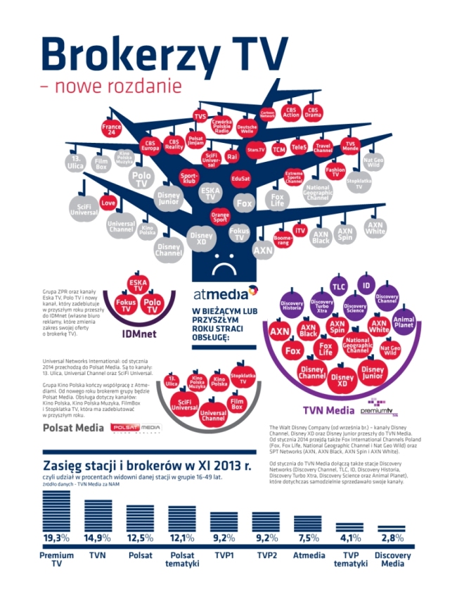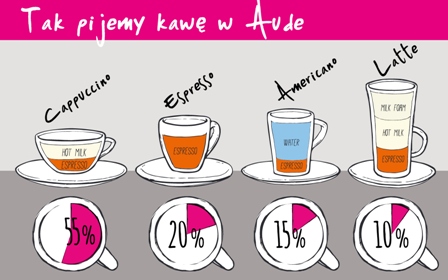
When I heard on the radio about a PhD thesis entitled “Infographic as a tool for exploring the world and understanding oneself – before and now” – I pricked up my ears instantly and wrote down the name of the young PhD. But Magda is no rookie to the subject; she has been into graphic designing and visual communication for over 15 years (here you can view her new project), specializing in visual information designing and particularly in presenting numeric data, diagrams and models. As she says: “In my work I try to combine a deep analysis of the represented data and phenomena with an attractive and clear graphic form, to make my designs effective messages.” You can view her works here and one below the paragraph.

When designing infographics Magda draws from the work of The Isotype Movement, a group formed by Otto Neurath (1882–1945), Vienna philosopher, economist and sociologist, together with Marie Reidemeister, Vienna physicist and mathematic and simultaneously a student of the Academy of Fine Arts, and Gerd Arntz, German artist, who was – as they themselves used to call him – the last indispensable element of the team. Together they created the ISOTYPE (International System of Typographic Picture Education), describing it as an alternative language, which was inspired by Egyptian hieroglyphics, among others. It’s funny we often call something hieroglyphics when it’s convoluted and hard to understand, while the essence of infographics is… explaining the world in a simple way.
Simplicity is the feature of infographics mentioned by our clients right after effectiveness. They tend to ask more and more often to add an infographic to a text or replace it with one altogether. Frequently, I must admit that an infographic will do better than a text (in a magazine, newsletter, etc). The main argument is: No one is going to read that! And even if I get jittery about it and say that I would read it, I have to think about my audience. Only in the last six months I had several cases when I replaced a traditional article with an infographic – and that was a good change. Look at our medical infographics. And about superheros… 🙂

The human brain needs only one tenth of a second to grasp the meaning of a message represented with an image. But to efficiently process a text made up of 200 words, it needs as long as a minute…
A good infographic, saturated with content, is like an information pill that you can swallow easily, metaphorically speaking.
Kategorie: school of contentic